
Digitizing
Which underlay belongs under a satin column and a fill
Underlay is the stitching the mockup hides and the sew-out exposes. The type you put under a narrow letter is not the type you put under a wide fill.
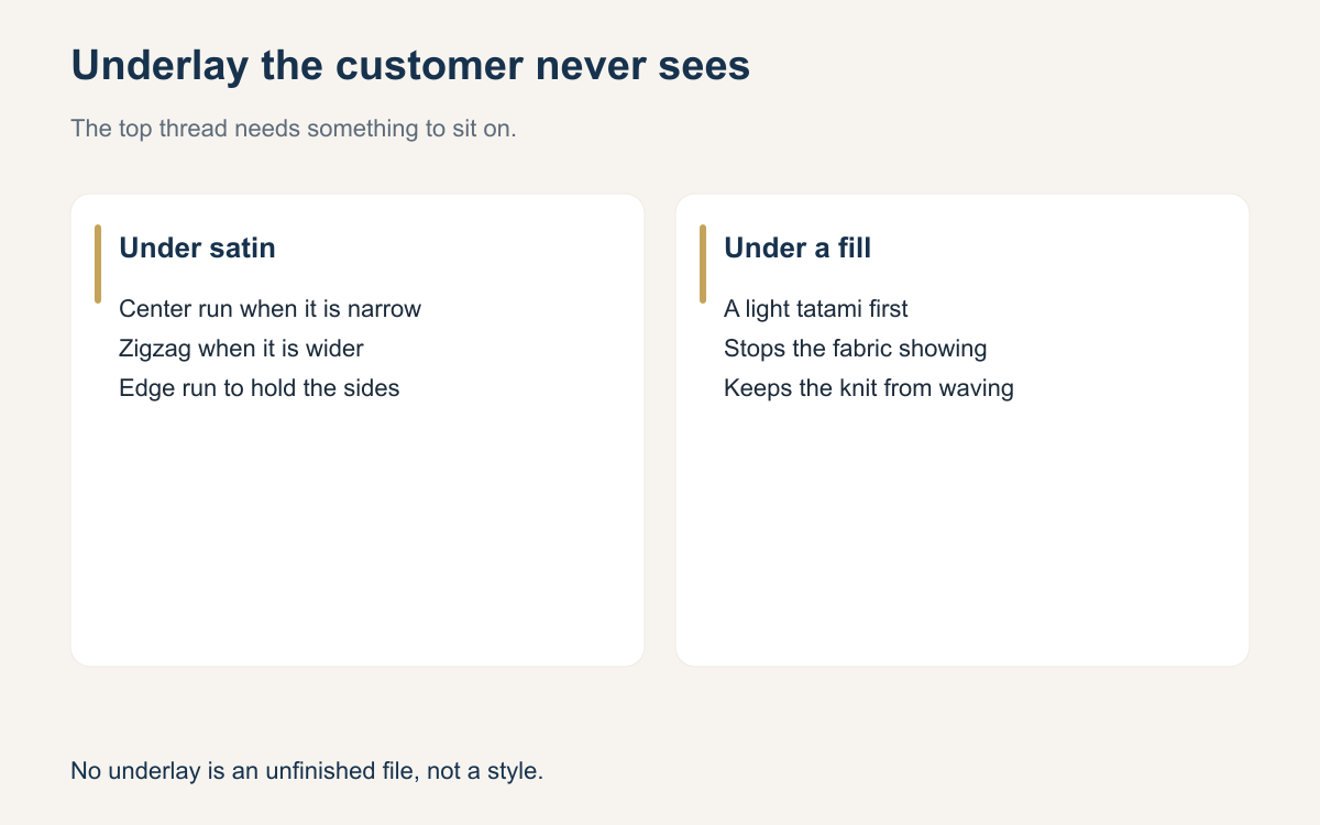
Underlay is the first stitching in a shape, sewn before the thread the customer notices. It is there to hold the fabric down, to keep the top color from looking speckled, and to give satin an edge to sit on. Files that skip it can look fine in the software, because the software draws the top stitches as a solid color. On a pique polo or a cap they look thin, and after a wash they look worse.
There is no single underlay that belongs under everything. A center run under a wide fill does almost nothing. A heavy tatami under a tiny letter can fill the counters and make the word blob. Match the underlay to the stitch on top and to the fabric under it. Then sew one sample on the real blank before you decide the file is done.
What underlay is doing
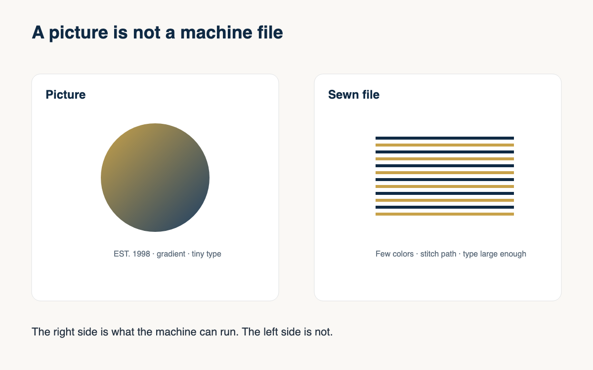
Three jobs show up again and again. Underlay stabilizes a knit so the top stitches do not pull the fabric into waves. It covers the blank color so a light thread on a dark shirt does not look gray. And it builds a slight ridge so a satin edge stays crisp instead of sinking into the texture of the garment. If your sew-out is puckering, speckled, or soft at the edges, look at the underlay before you blame the tension.
More underlay is not automatically better. Every underlay stitch is a hole and a bit of time. A file that lays a dense underlay and then a dense top stitch can turn a chest logo into cardboard. The goal is the least underlay that lets the top thread look even on that fabric. On a stable woven you may need very little. On a stretch polo you need enough that the shirt still looks like a shirt when the hoop comes off.
Under a satin column
Narrow satin, the kind you use for small letters, usually wants a center run: one line of stitches down the middle of the column. It keeps the column from wandering and it does not fill the letter in. When the column gets wider, a center run is not enough to support the edges. Digitizers move to a zigzag underlay, or an edge run along both sides, so the satin has two rails to cover. That edge support is what keeps a border from looking broken.
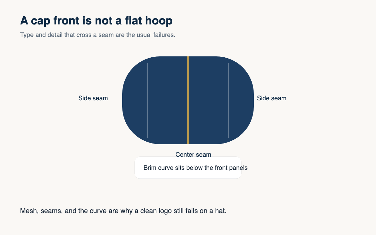
Watch the sequence. Underlay should sew before the top satin in that same shape, and it should stay inside the column. An edge run that sits outside the art shows as a second outline, especially in a contrasting thread. If your software is auto-adding underlay, open the shape and look. A default that was fine on a jacket back can be too much on a cap letter. Turn it down, or change the type, rather than hoping the top stitches will hide a bad first pass.
Under a fill
A fill underlay is usually a lighter, more open version of a fill, often sewn at a different angle from the top stitches. The angle change is the point. It ties the fabric down in one direction and lets the top stitches cover in another, so the blank color does not wink through the rows. On a knit, that first pass is also what keeps the fill from pulling the shirt into pleats. Skip it and you will chase the problem with density, which makes the pleats worse.
Keep the underlay inside the shape and lighter than the top. If the underlay is as dense as the cover stitch, you have doubled the sew time and the stiffness for a small gain in coverage. On towels and fleece, underlay alone will not stop stitches from sinking. Those goods want a topping as well, a film that holds the thread on the surface and then washes or tears away. Underlay and topping are different tools. Use both when the fabric texture is the problem.
Check it on the sew-out, not in the software
The screen lies in a specific way. It draws every stitch as a clean dash and it never shows the nap of a polo. After you set underlay, sew the design on a scrap of the same fabric, with the same backing you will use on the order. Look at the edge of a satin letter, the middle of a fill, and the back of the fabric. Speckling means the underlay or the density is too open for that color on that blank. A stiff disc means you overdid one of them.
Save the underlay settings with the fabric, not only with the logo. The same mark on a hoodie and on a performance shirt should not share one untouched file. Note “zigzag under the satin, light fill underlay, cutaway” on the order. The next person who sews that logo, including you in six months, should not have to rediscover it from a bad sample.
- Center-run underlay for narrow satin letters.
- Zigzag or edge-run underlay when the satin column is wide enough to need rails.
- A lighter fill underlay, at a different angle, under areas.
- Less underlay on stable wovens, more support on knits.
- Topping, not more underlay, when the stitches sink into fleece or terry.
- One sew-out on the real fabric before you call the file finished.
If a file has no underlay at all, treat that as a question, not as a style. Some tiny runs on a firm cap front can live without it. Most logos on knitwear cannot. Open the sequence, name what is under the top stitches, and change it when the scrap looks thin or stiff.
The customers will never ask for underlay. They will ask why the white thread looks gray, or why the shirt wrinkles around the mark. You already know which layer answers that.
A question for the group
Do you set underlay by fabric, by stitch type, or do you leave the software default and fix it only when a sew-out looks thin?