
Designs
How to simplify a logo so embroidery can actually sew it
Most logos are drawn for a screen. Embroidery needs fewer colors, thicker lines, and a version that still reads at the size of the blank.
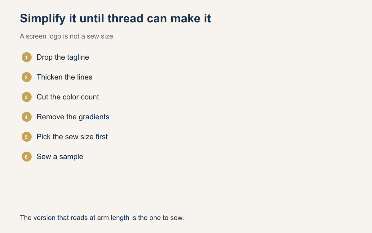
A customer sends a logo that looks finished because it is finished, for a website. It has a gradient, a drop shadow, a tagline, and a line of type that is elegant at the width of a browser window. At four inches on a chest, or two inches on a cap, that file is a list of things thread cannot do. Simplifying it is not a favor you hide. It is the design work that makes the sew-out look like the brand instead of a smudge.
Do the simplifying before anyone digitizes. A careful stitch plan cannot rescue eight-point type. If you send the poster version to be digitized and hope, you will pay for a file and then pay again to redo it. Show the customer a simpler mark at the real size, on the real blank color, and get a yes to that mark.
Decide the size before you edit
Ask where it goes and how wide it will be. A left chest and a jacket back are different drawings. Print the logo, or view it, at that width and step back an arm’s length. Whatever you cannot read from there will not be readable in thread. Circle the parts that disappear: the tagline, the registered mark, the thin rings, the texture inside a letter. Those are the first deletions.
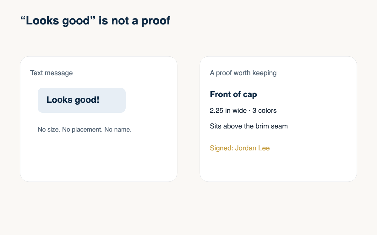
Say the size in inches when you talk to the customer. “Small on the hat” is how the detailed version sneaks back in. “Two inches wide on the front panel, three colors, no tagline” is a design you can sew and a sentence they can agree to. If they have not picked a blank, you are still guessing, and every edit you make may be for the wrong hoop.
Thicken, then delete
Thin lines become satin that will not hold, or a running stitch that vanishes into the fabric. Thicken the strokes that carry the mark until they are honestly sewable at that size. If thickening makes two letters crash together, the word is too long for the space. Shorten it, or move that word off the garment and onto a hang tag. Do not split the difference with letters that almost clear.
Then delete. Gradients become bands of thread or they become noise. Drop shadows become a second shape you did not mean to sew. Interior textures, halftones, and tiny icons inside a letter should go. Keep the one or two shapes a stranger would recognize. A shop that tries to sew the whole brand system on a cap is sewing the brand system badly. A shop that sews the mark cleanly looks more expensive, even though the file is simpler.
Cut the color count to what the size can hold
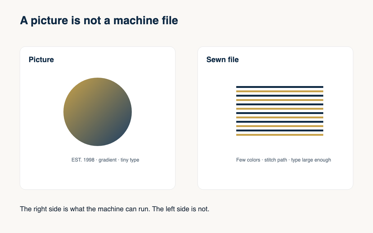
Every color is a stop, a trim, and a shape that needs room. At chest size you can often keep three or four colors if each one is a real area. At cap size you may be down to two colors plus the fabric. Count colors that still exist after you delete the small parts, not colors in the original file. A one-stitch-wide stripe is not a color. It is a mistake.
Use the garment as a color when you can. A navy logo element on a navy cap does not need navy thread if the fabric can be the shape, which is one reason appliqué and open designs work. When you do need thread, match it on purpose and tell the customer the palette got smaller so the mark stays sharp. Show the reduced version. People accept a simpler logo when they can see it. They argue when you only describe it.
Keep a sew version and a print version
Do not overwrite the customer’s original. Save a sew version with a name that includes the blank and the width, and keep the print file untouched. The next order may be a jacket back that can hold more of the original. If you only have the simplified cap file, you will either sew the cap version huge on a back, which looks sparse, or you will rebuild the art from memory.
Tell the customer what they are approving. “This is the cap version. The website file stays as it is.” That sentence prevents the email that says you ruined the logo. It also makes the next quote faster, because you already know which file belongs on which blank. Charge for a new sew version when the placement changes enough to need new art. A reorder of the same cap file is not new art.
- Lock the width and the blank before you edit.
- Delete type and icons that fail at arm’s length.
- Thicken the strokes that remain until they can be satin or a clear run.
- Drop gradients, shadows, and colors that have no area.
- Save the sew file separately from the print file.
- Get a yes to the simpler mark before digitizing.
Simplifying feels like you are taking something away. On the machine you are giving the logo a chance to look like itself. The detailed file can live on the website. The cap gets the version thread can make. Shops that explain that once, with a picture, spend less time redoing files than shops that sew the poster and apologize.
The next logo that arrives as a screenshot, do the arm’s-length test before you open the digitizing software. If you already know what has to go, the conversation is shorter and the sew-out is cleaner.
A question for the group
What is the first thing you delete when a customer sends a full brand lockup for a cap, and how do you show them the simpler version?