
Digitizing
When to use a satin stitch, a fill, or a running stitch
A letter, a wide shape, and a thin outline are three different marks. Satin, fill, and a running stitch each fail when you ask them to do another stitch’s job.
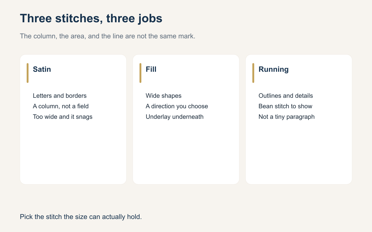
Digitizing starts with a boring question. Is this shape a column, an area, or a line? A column wants satin. An area wants a fill. A line wants a running stitch, sometimes doubled so it shows. Shops get into trouble when they use one stitch for all three because that is what the art program drew, or because the last file happened to be satin and this one looks similar on the screen.
The customer will not name the stitch. They will say the letters look fuzzy, the background looks stiff, or the outline disappeared. Those are stitch choices you can see in the sew-out. Learn to name them before the machine runs, and a lot of “the thread looks cheap” complaints turn into a file you can fix.
Start with the width, not the picture
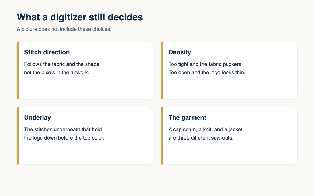
Hold the artwork at the size you will actually sew. A stroke that looks bold at poster size may be a hairline at two inches. A shape that looks like a letter may be wide enough to be a fill once you measure it. If you cannot see the difference on the screen, print the design at sew size or measure the path in the digitizing software. Guessing from a zoomed-in logo is how satin columns get asked to cover a field.
Write the choice down for the main parts. The wordmark is satin. The shield behind it is a fill. The thin border is a running stitch. If a part does not fit any of those, it is probably too detailed for this size, and the next step is to delete it or thicken it. Do not invent a fourth stitch to rescue a detail the needle cannot make.
Satin is for columns
Satin stitches swing from one side of a column to the other. That is why letters, borders, and stems look clean when they are satin: the thread lies across the shape and the edge stays sharp. It stops working when the column gets wide. Long satin stitches snag, gap in the middle, and look loose after a wash. Many digitizers split a wide column, or they switch that shape to a fill, once the swing is long enough to catch a finger. Treat that as a shop limit you set, not as a number you copy from a stranger’s chart without sewing it.
Pull compensation belongs on satin. The column narrows as it sews, so the file is drawn a little wider than the art. Skip that and the letters look skinny, or two neighboring letters crash into each other. Also give satin an underlay. A narrow column can sit on a center run. A wider one wants a zigzag or an edge run so the top stitches have a shelf. Satin with no underlay on a knit is how a clean letter turns into a wavy one.
A fill covers an area
A fill, often a tatami or a similar walking stitch, covers a shape that is too wide for satin. The stitches travel in a direction you choose. That direction is not decoration. A fill that runs the long way of a shape can look smooth. The same fill turned the other way can look rippled, or it can pull the fabric along the grain. On a cap, a heavy fill is also how the front panel craters. Lighter density plus underlay usually looks fuller than a packed fill with none.
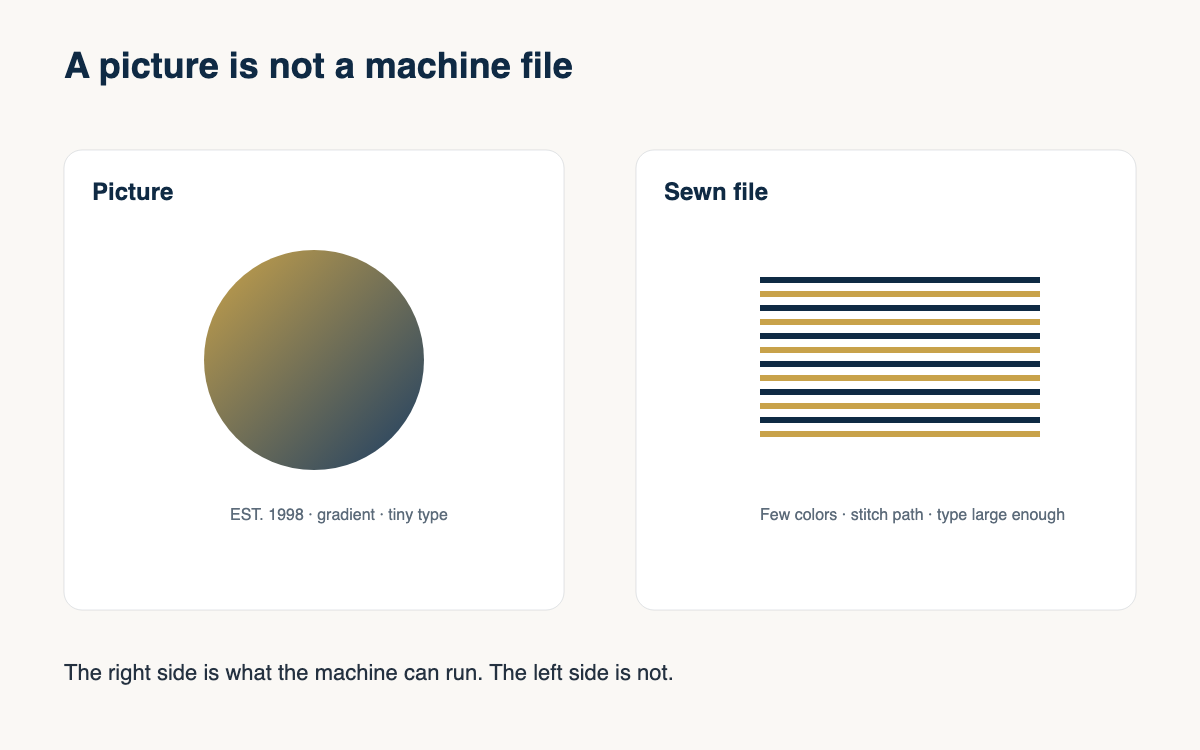
Fills fail when they are used as a substitute for detail. A photograph, a gradient, and a texture of tiny shapes are not fills waiting to happen. They are pictures. If you turn them into a fill, you get a textured brick that does not look like the picture and does not feel like fabric. Simplify the shape until it is one honest area, then set the angle, the density, and the underlay for the blank.
A running stitch is a line
A running stitch follows a path. Use it for outlines, for details that are too thin for satin, and for travel stitches you will hide. A single run can vanish on a textured shirt, so shops often use a bean stitch or a double run when the line has to be seen. That is still a line. It is not a way to sew a paragraph. If the line is a phone number at cap size, the running stitch will not save it. Delete the line.
Watch the travel. A running stitch that jumps across open fabric shows up as a glint, especially in a light thread on a dark shirt. Trim those travels, or route them under a later fill. And do not outline every satin letter by habit. An outline on a small letter fills the counter and makes the word look muddy. Outline a shape when the edge needs it. Leave it off when the satin edge is already the design.
- Measure the shape at sew size before you pick the stitch.
- Use satin for columns and letters that are thick enough.
- Switch a wide column to a fill, or split it, before the stitches get long enough to snag.
- Use a running or bean stitch for lines, not for tiny copy.
- Put underlay under satin and fills on knits and textured blanks.
- Sew a scrap when the choice is close. The scrap is cheaper than the order.
You do not need a new vocabulary for every file. Column, area, line. Satin, fill, running stitch. If a part of the logo is none of those at the size you were given, it does not belong on that blank. Tell the customer you are changing the stitch so the mark will read, and show them the simpler version next to the original.
The next logo you digitize, name the stitch out loud for the three biggest parts before you set density. If you cannot name it, you are still looking at a picture.
A question for the group
Where do you draw the line between a satin column and a fill, and did you learn that limit from a chart or from a sew-out that snagged?