Placement
How to get the right design for each blank
A logo that looks finished on a flat square is often the wrong design for a cap, a chest, or a tote. The blank decides the size, the seams, and the version you should sew.
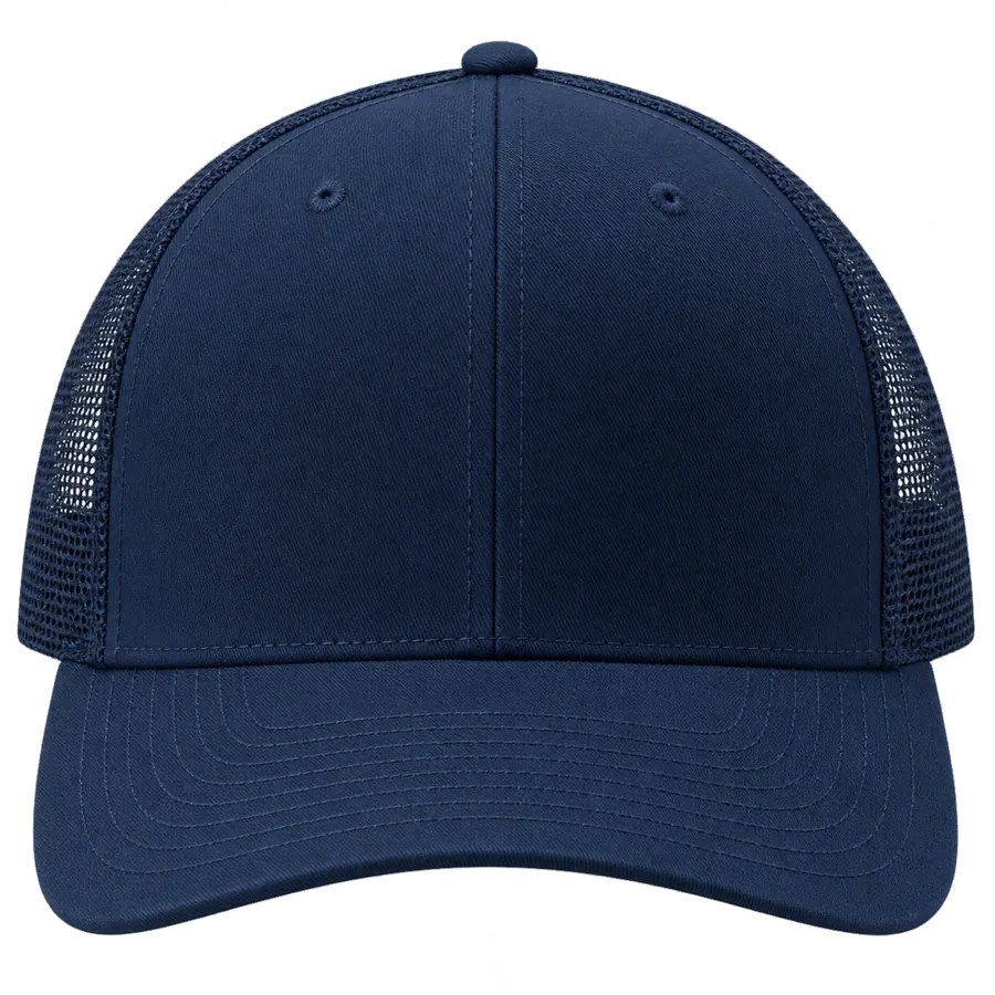
Customers send one picture and a list of products. The same crest on a hat, a polo, and a tote bag. On the screen it is one design. On the machine it is three jobs, and two of them are usually the wrong drawing for the blank in the hoop.
The right design is the one that fits the sewable part of that product. It stays off the seams that will split a satin stitch, it is large enough to read as thread, and the customer has seen it on that color of that blank. A pretty file that ignores the product is a redo waiting for the first sew-out.
Start with the blank, not the artwork
Ask which product, which color, and which placement before you open the art. A jacket back can hold a tall crest. A cap front cannot. A left chest is a small, moving knit. A sleeve is narrower than people think once the hoop and the seam allowance are real. If they have not chosen a blank, you do not have a design yet. You have a picture, and pictures do not tell you where the needle is allowed to go.
Name the placement in words they can repeat. Front center of the cap. Left chest, about four inches wide. Full back, stopping above the hem. “Somewhere on the hat” is how the design ends up on the seam. Write the placement on the order when you quote, not after the customer says the sample looks low.
A cap is a short, seamed surface
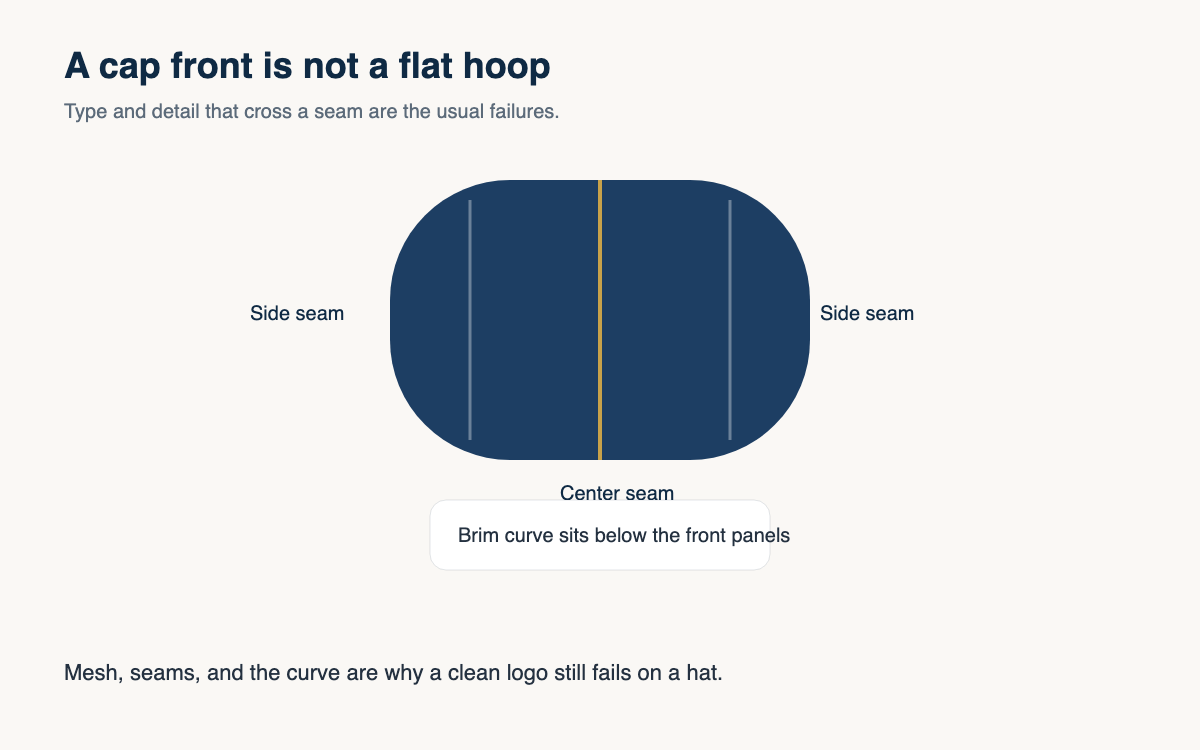
A structured cap is curved. The front panels meet at a seam. The side panels may be mesh that will not hold a satin stitch. The brim curves away from the hoop. A logo that looked balanced in a square often lands on the seam, or the smallest word falls into the mesh, or the design is simply taller than the front panel can hold.
The cap version of a logo is usually shorter, with fewer words and fewer colors. Drop the tagline. Drop the phone number. Center the mark on the panel, not on the photograph of the whole hat. If the only way to fit the art is to cross the center seam with thin type, the art is not ready for that blank. Offer the simpler mark. Do not promise the poster version at cap size.
Shirts, hoodies, and sleeves are different hoops
A left-chest logo is a small design on a fabric that moves. Fine lines and tiny type that look crisp on a screen turn into a blur of thread. A full front can be larger, but a hoodie pocket, a placket, or a zipper will eat the middle of the art. A sleeve is a narrow field. The design has to be short enough to hoop without grabbing the side seam, and simple enough that a curved arm does not turn the letters into a wave.
Fleece and pique are not the same file if you care how the fill looks after a wash. A dense design that sits nicely on a smooth polo can sink into a pile or ripple a light knit. When the customer wants the same mark on a tee and a hoodie, say that the size and the stitch plan may change even if the picture stays recognizable. That sentence, said before the order, is cheaper than a second digitize after the first sew looks wrong.
Bags look flat until the hardware shows up

A tote feels easy because the panel is flat. Then the pocket, the handle, and the side seam take the space the design needed. A mark centered on a product photo can sit half under a pocket on the real bag. Measure the clear panel, not the whole bag. If the design only works when it runs into the strap, it is the wrong design for that blank.
Keep a separate version when the product changes shape. The cap version, the chest version, and the large flat version can share a name and a customer. They should not share one unchanged drawing that you scale until it fits. Scaling a jacket crest down to a cap does not remove the detail the cap cannot sew. It only makes that detail smaller.
The customer has to see that blank
Approval of a white-shirt mockup is not approval of a navy cap. The color of the blank changes which parts of the design disappear, and the shape of the blank changes where the design sits. Show the art on the product and the color they are buying. State the width in inches. “Looks good” on a different garment is how both of you end up sure the other person moved it.
If you cannot show that exact blank, say so, and describe the placement in a sentence they can answer. Front of the navy cap, about two inches tall, above the brim, not crossing the seam. A sentence is weaker than a picture of the real product. It is still stronger than a screenshot of a different hat.
- Choose the product, the color, and the placement before you redraw the logo.
- Keep a cap version, a small chest version, and a large version when the shapes differ.
- Stop the design at seams, mesh, pockets, zippers, and handles.
- Get the yes on that blank, at a stated width, before anyone hoops it.
Shops that do this stop arguing about whether the logo is “nice.” They argue about whether it fits the thing they are about to sew. That is the argument you can settle with a tape measure and a picture of the real blank. Stitchify Hub’s Designer is built for that check: the art sits on the product and color the shop set up, inside the area that product allows, so the picture and the blank are the same object.
The next time a customer sends one file and three products, do not scale it three times and hope. Make the cap version first, because it is the strictest. If that version is clear, the chest and the tote have somewhere honest to start. If the cap version only works by deleting half the words, tell them that before you quote all three. The right design is the one that belongs on the blank in your hand, not the one that won on a square background.
A question for the group
Which blank in your shop forces you to redraw a logo that was fine on something else, and what do you delete first?