
Growing the shop
Mistakes embroidery shops make when selling online
Online embroidery sales stall for ordinary reasons: a mockup that will not match the sew-out, options that confuse, a quote that never arrives, policies nobody can find, and a checkout that adds work at the last step.
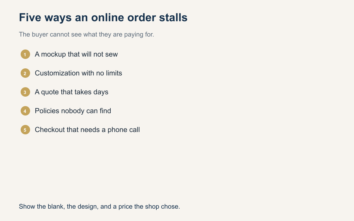
Selling embroidery online is not a different trade. It is the same trade with the buyer in another room, comparing you to two other tabs. The mistakes that lose the order are dull. The mockup does not look like the shirt. The options do not match how you sew. The price is a promise to reply later. The rules appear only after they are upset. The last step asks them to start over.
None of these require a new machine. They require you to look at the path the way a tired buyer looks at it on a phone. If a step needs a speech from you, the page is not finished. Fix the five mistakes below in the order they hit the buyer, and you will feel the difference in paid orders before you feel it in a prettier homepage.
A weak mockup teaches them not to trust you
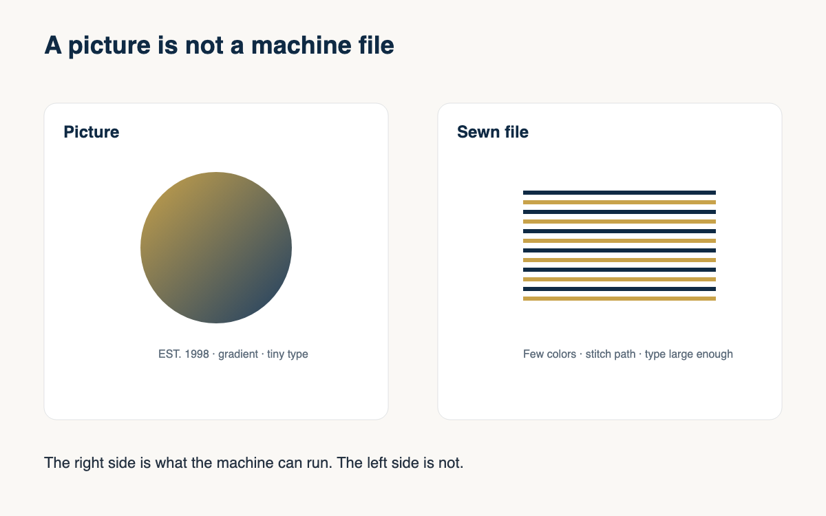
The common weak mockup is a crisp logo floating on a white rectangle when the buyer ordered black, or a photo of a hat you do not sell. They approve the picture. You sew thread on the real blank. The two do not match, and they decide you were careless. You may have been honest in a message they did not read. The picture is what they believed.
Show the real garment color and a design that respects what thread can do. Do not present hairline script you will have to thicken later, and do not present eight colors in a mark the size of a coin. If you cannot photograph every color, photograph the ones you stock and say the others are the same cut. A plain photo of the blank with the art placed at the real size will outsell a glossy picture of a different product.
Custom options that confuse will not convert
A page full of dropdowns feels like service and shops like a form. Color times size times placement times thread is a puzzle, and a notes box that says describe what you want assumes they know the words. They do not. They know they want the logo on the hat, bigger than a postage stamp, and not on the mesh. If you make them translate that into your system, many of them leave.
Ask for the garment, the color, the placement, and the art, in that order, with one example of a normal choice. If a choice is not sewable, do not offer it. Hide the placements you will not hoop. Limit thread colors to the set you actually run. Confusion is not a sign that the buyer is difficult. It is a sign that the page is asking questions you should already have answered with a default.
A slow quote is a lost online order
Online buyers do not wait in one tab out of loyalty. If the price is message us for a quote, you are absent from the comparison they are making tonight. They will pay a shop that showed a number, even if your sew-out would have been better. A slow quote is not a quality signal. It is an empty shelf.
Publish prices for the placements you sew every week, with a sentence about what the number includes. Use a person for the odd job: a full back, a photo, a jacket with a zipper in the way. Tell them when that number will arrive, and keep the clock. A chart for the common work and a dated reply for the strange work is the whole system. Anything else trains buyers to think you are closed.
Policies they cannot find become arguments
Turnaround, how many art changes are included, whether they may send their own shirts, and what you do with a photo instead of a logo should be visible before they pay. If those rules live in your head, the argument happens after you sew, when the money is already awkward. Buyers are not hunting a legal document. They are trying not to be surprised.
Write the policies in the same words you would use in a message. Seven business days after approval. Two rounds of art changes, then a fee. Shirts you did not buy are sewn at your risk and theirs. Photos of people are simplified or refused. Put that text where the price is, not on a footer they will never open. A policy they can see is a reason to trust you. A policy you reveal after the complaint is a reason to leave a sharp review.
Checkout friction shows up at the last step
The last step should confirm a decision they already made. It should not open a new project. Friction looks like a required account before they can see a total, a shipping cost that appears only after they commit, a payment method that fails, or a note that says call the shop to finish. Each one is a door closing on a person who was ready.
Read your own checkout on a phone and count the questions that repeat facts they already gave. Color, quantity, and placement should not be typed twice. The total should include the choices you can see. If a job is too odd to check out, say so before the last step, and give the ordinary hat a path that finishes. The goal is a paid order with a spec you can hoop, not a conversation that restarts at midnight.
- Show the real blank color and a design size you are willing to sew.
- Offer only placements and thread choices you will actually run.
- Publish a price for standard work and a clock for odd quotes.
- Put turnaround, changes, and supplied blanks next to the price.
- Make the last step a confirmation, not a second interview.
- Remove any step that asks them to call in order to pay for a normal job.
Walk one order through your own site as if you were tired and in a hurry. Note the first moment you would have closed the tab. Fix that moment before you add another product photo. Online sales reward the shop that makes the blank, the design, the price, and the rules visible. They do not reward the shop that is excellent only after a long chat.
Those five mistakes are process. A storefront that shows the blank, the design on that blank, and a price the shop chose removes two of them: a mockup that does not match the sew-out, and a quote that only exists in a chat. Stitchify Hub is built for that shop workflow. It does not decide what you will sew.
A question for the group
Which of the five mistakes showed up on the last order you lost online, and what can a buyer see without messaging you?