
Thread
How to match a logo color to an embroidery thread
A logo color on a screen is not a cone of thread. You match to the closest number in the chart you stock, then you look at it on the blank.
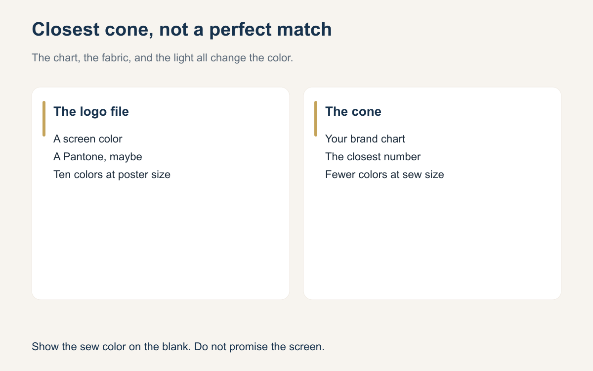
Customers talk about color as if thread were ink. They send a hex code, a Pantone, or a screenshot and expect the hat to match the phone. Thread is a dyed fiber sewn in rows, on a fabric that has its own color, under whatever light is in your shop. The honest promise is the closest cone you stock, shown on the blank, not a perfect replica of a monitor.
You can still be precise. Precision is using one brand’s chart, writing the number down, and checking the cone against the garment before you sew twelve. It is not owning every brand so a number on a PDF can be obeyed literally. A shop with one polyester chart and a habit of looking at the thread on the fabric will match more reliably than a shop with four catalogs and no note on the order.
Start from the chart you actually sew
Pick the line you sew, Isacord, Madeira Polyneon, a Robison-Anton polyester, or whatever you have committed to, and match inside that chart. Brand conversion charts and Pantone-to-thread tables are a starting point. They are not a guarantee that the customer’s Pantone exists as thread, or that two brands’ “match” will look the same on a navy shirt. If your wall is polyester, do not quote a rayon number because a website cross-reference said they were twins.
Ask for a real color reference when the job is picky: a Pantone if they have one, or a physical garment, or the previous hat. A screenshot is the worst reference, because you cannot know how their phone was set. Tell them you will match to the nearest thread and show it. Shops that skip this sentence end up resewing a red that was always going to be the wrong red. The sentence is part of the quote.
The blank changes the color
The same cone looks different on white, navy, and heather. A light fill on a dark shirt will look darker and more broken if the density and underlay are not covering. A dark thread on a dark cap can disappear even when the number is “correct.” Lay the cone, or a sew-out scrap, on the actual blank in daylight if you can. Shop fluorescents lie, and they lie differently than the customer’s office.
This is also why you cut colors. A logo with ten colors at poster size may have three that still read on a cap, and two of those may be so close that one cone should do both. Merging close colors is a favor. Sewing both because the file had two numbers produces a texture change the customer did not ask to see. Explain the merge with the cones in your hand, or with a photo of the cones on the blank. People argue with a description. They usually agree with two threads held on the hat.
Write the number where the reorder can find it
Record the brand, the material, and the color number for every color in the design. “Blue” is not a record. A photo of the cones is a nice extra and a bad only copy, because photos shift. The number in the order, and in the file name or the design notes, is what another person can reorder. If you rewind bobbins or prewound that color, label the reel. The next shift should not have to color-match from memory.
When a customer says the reorder does not match, check the note before you defend the sew-out. If you changed brands, or you ran out and substituted a “close” cone, they may be right. If the note matches and the blank is a different dye lot, say that. Garment colors move too. The way through the complaint is the written number plus a scrap, not a speech about how monitors work. Keep one sewn scrap with the difficult logos. It ends the argument.
Do not promise the screen
Put a short line in your quotes and on your price list: thread colors are the closest match in the brand you sew, confirmed on the garment. You will not hit every Pantone. You will not reproduce a gradient. You will not match a metallic ink with a cotton cone. Customers who need a laboratory match are sometimes in the wrong process. Embroidery is allowed to look like embroidery. The ones who stay are the ones you told the truth early.
If a color is truly missing from your chart, order it before you sew the set, or offer the nearest cone with a photo. Sewing “close enough” on twenty jackets because the right cone is two days away is a bet. Sometimes the schedule forces the bet. Then you are choosing lateness against a remake, and you should say which one you are choosing. A secret substitution is the version that ruins the relationship. A photographed substitution is a decision they can accept.
- Match inside the one thread line you stock.
- Treat Pantone charts as a start, then look at the cone.
- View the thread on the real blank, not only on white.
- Merge colors that will not read as different at sew size.
- Write brand, material, and number on the order.
- Promise the closest thread, not the screen.
Color matching is a record-keeping job that happens to use your eyes. The chart gets you to a cone. The blank tells you if that cone is honest. The note on the order makes the reorder boring, which is what a reorder should be.
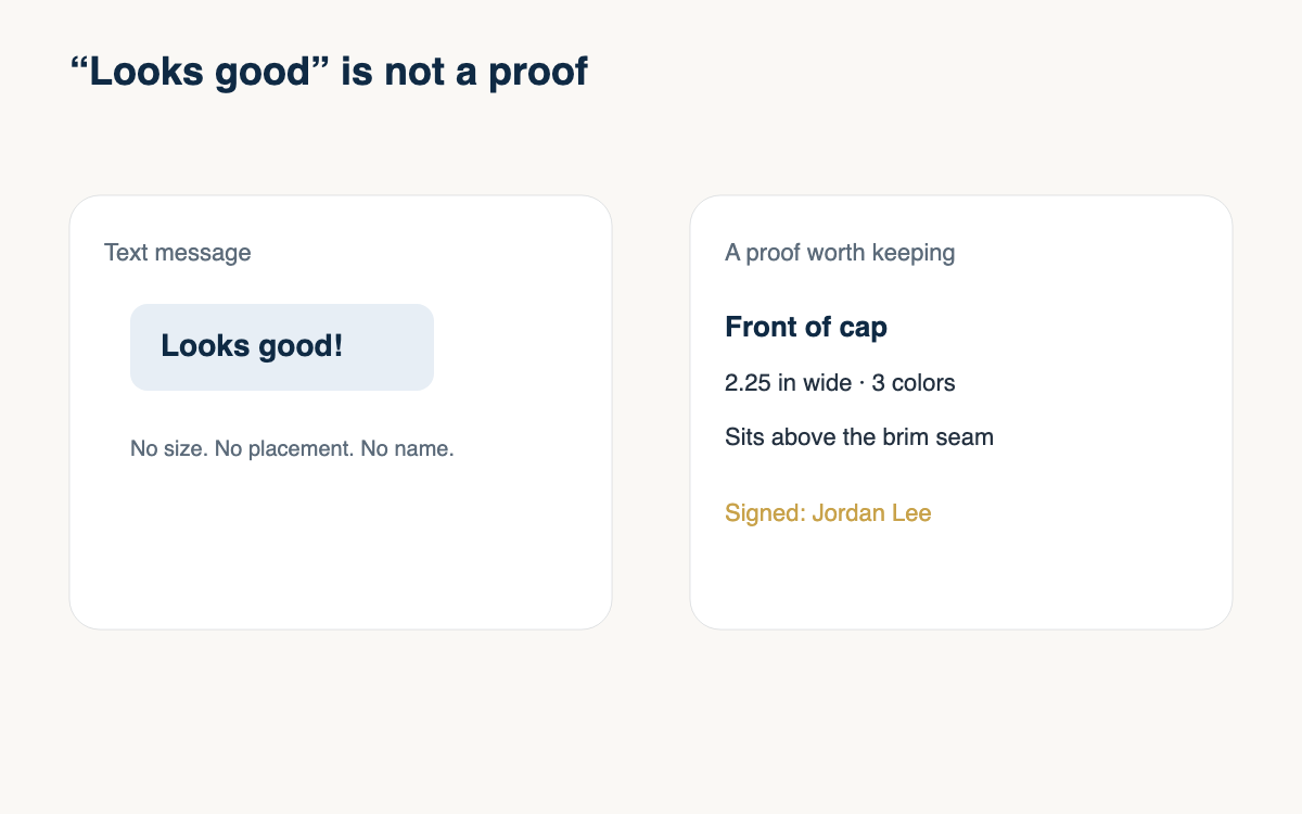
The next logo with a specific red, pull two cones, put them on the garment, and send the photo with the number you chose. You will sew the right one, and you will have the proof when someone remembers the color differently.
A question for the group
Do you match from one thread brand only, and what is the color that still fools you no matter how careful the chart is?