
Techniques
How small can embroidery lettering be?
Satin lettering often fails under about a quarter inch. Running stitch can go smaller and still has a floor. Thick strokes survive, taglines and phone numbers do not belong on caps, and pique swallows type that looked fine on a screen.
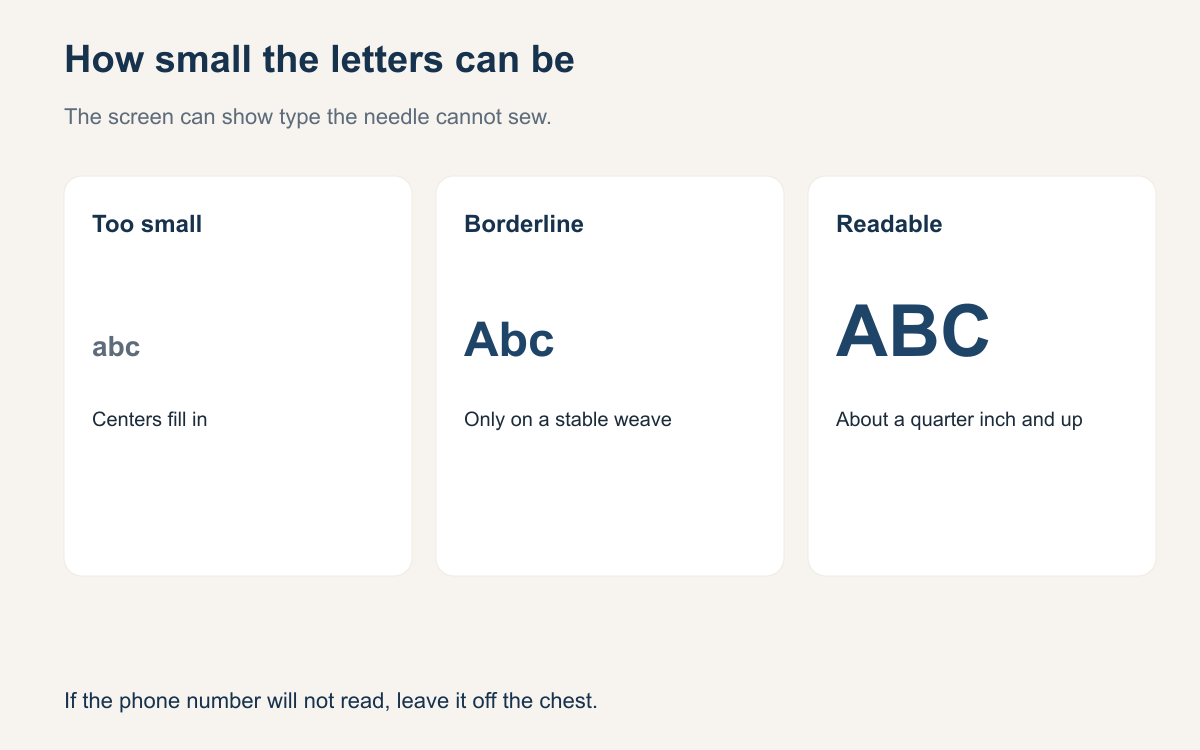
Customers send type that looks sharp on a phone and falls apart on a shirt. The letters are too narrow, the centers fill in, and a tagline becomes a smudge under the logo. That is not a tension mystery. Thread has a width. A column of satin has to be wide enough for the stitches to lie side by side instead of piling on the same holes. Below that width you are not sewing letters. You are sewing a ridge.
You need a floor you can say out loud before you quote. The numbers below are shop practice, not a standard from a thread mill. They are the sizes many shops can repeat on ordinary blanks without a hero sample. If your machine, your needle, and your fabric can beat them on a sew-out you are willing to wash, use your number. If you have not sewn the test, do not promise the screen.
Satin fails under a quarter inch
Satin columns are how most block letters get their smooth edge. They need width. Under about a quarter inch, the column is so narrow that the stitches stack, the edge walks, and the letter looks like a blur or a hard cord. On a good day, with a fresh needle and a smooth woven, you might sneak a simple letter a little under that and have it read at arm length. On a normal day, a quarter inch is the floor for satin, and plenty of shops set the floor higher.
If the smallest letter is under a quarter inch tall, do not sew it as satin on the run. Make the word bigger, drop it, or switch to a running stitch you have already tested. Measure at sew size, not at the size of the original art. A tagline can shrink a word that looked fine in the logo file.
Running stitch still has a floor
A running stitch can go smaller than satin because it is a line, not a filled column. It can outline a letter or build a simple stroke that satin cannot hold. It cannot go as small as a printer. The needle still punches a hole, the thread still has thickness, and the fabric still moves. Many shops will try running-stitch letters around 0.2 inch on a smooth woven and will refuse anything smaller, because the centers close and the word stops being a word.
About 0.2 inch is a practical minimum you can apply on smooth fabric, not a record. A thin script needs a higher floor. The hole in an a, an e, or an o has to stay open. Sew that size on the real fabric and read it from arm length. If you have to squint, do not sell it.
Use fonts with thick strokes
Small lettering lives or dies on the stroke. A block font with a thick, even stroke gives the needle something to follow. A fashion font with a hairline crossbar, a tiny serif, or a swash that comes to a point will break up as soon as you scale it down. The pretty part of the font is the part thread cannot make. Pick the duller font. It will look clearer on the garment, which is the only place the customer wears it.
At a small size an e fills in and tight spacing turns two letters into one. Open the gaps. Prefer a thick stroke that was built for sewing. If you cannot thicken the stroke without changing the mark, the mark is not ready for that size. Show a thicker version while you are still quoting.
Drop taglines and phone numbers on caps
A cap front is a small, curved, seamed panel. It can hold a short word or a simple mark at a size thread can sew. It cannot hold a company name, a tagline, a street, and a phone number and still have any of them read. The tagline is the first thing to drop. The phone number is the second. Those lines become the smallest type in the file, which means they are the first to fall under the floor you just set.
Put extra words on a hang tag or leave them off. A clean word on the front looks intended. A paragraph in thread looks shrunk. If the number has to be on the hat, it has to pass the same size floor as the name, which usually means it replaces the tagline.
Pique swallows small type
Fabric changes the floor. A smooth woven will show a small running stitch that pique will eat. Pique has a texture taller than a tiny stitch, so the letters sink into the ribs and the counters fill with the knit instead of with empty space. Fleece and terry do the same thing with pile. A size that passed on a test scrap of twill can fail on the polo you actually sell. The floor belongs to the blank, not to the font menu.
On pique, raise the minimum. Many shops refuse running-stitch micro type on pique even when they allow it on a smooth woven. Topping helps the stitches sit up, and it will not rescue a letter that was already too small. Sew the test on pique, not on a smooth scrap.
A minimum you can apply
Use this floor until your own sew-outs replace it. No satin letters under about a quarter inch, and larger on deep pique. No running stitch under about 0.2 inch on smooth fabric, and only with a thick stroke. Do not promise that 0.2 inch running stitch on pique. These are habits, not a law.
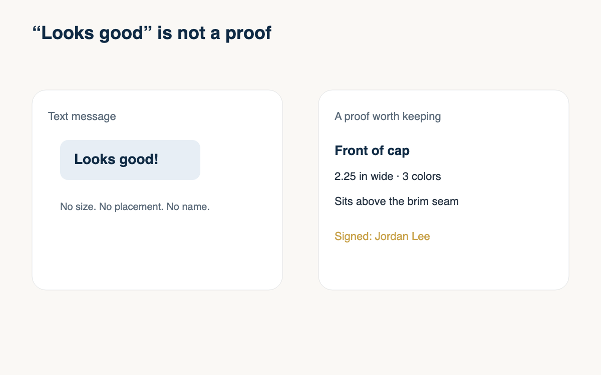
Say the floor before you take the order. Measure the smallest letter at sew size. If it fails, offer a bigger word, a shorter word, or a different blank. Do not offer hope. The customer can read eight-point type on a screen. They cannot read it in thread on a cap. A practical shop picks the version that still reads after a wash and lets the rest of the art live on paper.
- Measure the smallest letter at sew size.
- Keep satin at or above about a quarter inch, larger on deep pique.
- Treat about 0.2 inch as a running-stitch floor on smooth fabric.
- Do not promise 0.2 inch running stitch on pique, fleece, or terry.
- Use a heavy stroke and drop hairline serifs.
- Drop taglines and phone numbers on caps.
- Read a test on the real blank from arm length before you quote it.
Small type is a sales problem that shows up as a production problem. Set the floor, measure the file, and delete what fails. A shorter word at a size thread can sew will look sharper than the full name shrunk to fit. The next time a file arrives with a tagline, check the quarter inch and the fabric before you promise the screen.
A question for the group
What is the smallest letter you will still sew, and on which fabric did you learn that limit?