
Techniques
7 embroidery mistakes that make a design look cheap
A design looks cheap when the stitches fight the fabric. Tension, density, backing, tiny type, and a missing underlay are usually the reason, and each one has a fix you can check before the next sew-out.
A customer holds up a hat and says it looks cheap, and they are not talking about the blank. They are talking about the stitches. The fill looks thin in one light and stiff in another. A letter has a gap. The knit is puckered in a ring around the logo. None of that is fixed by buying a more expensive thread cone. It is fixed by changing the plan the machine is sewing.
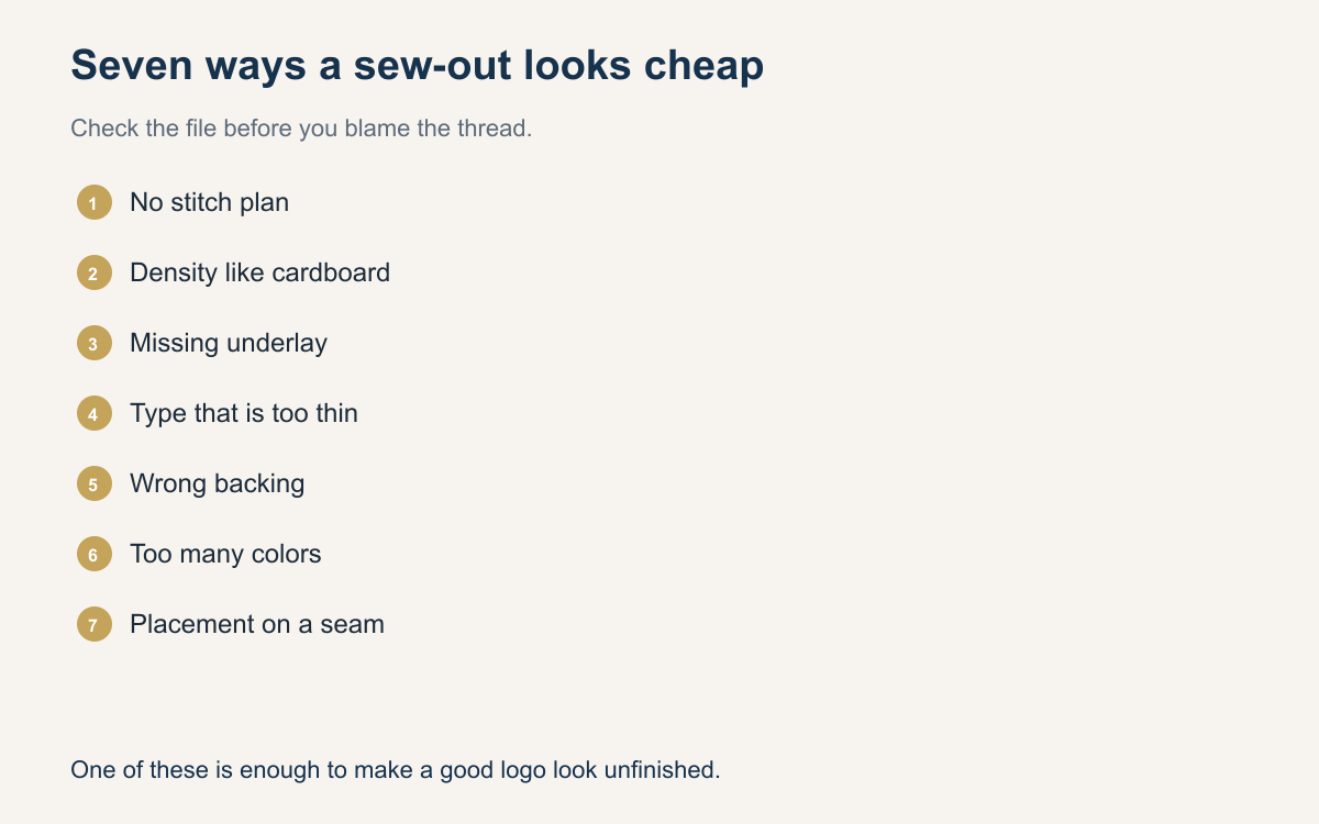
These seven mistakes show up on jobs that were rushed from a picture to the hoop. You do not have to make all of them. One is enough to make a decent logo look like a sample from a mall kiosk. Walk the sew-out with this list before you tell the customer it is done.
Sewing the picture instead of a stitch plan
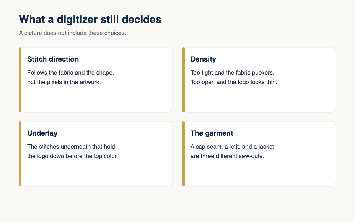
The first mistake is loading a picture, or a file that is only a trace of a picture, and expecting it to sew like a design someone planned. A stitch plan decides where the needle travels, which parts go down first, and how the top stitches cover the ones underneath. A trace follows the outline. Outlines that look smooth on a screen become jagged satin, and fills that were never given a direction look hairy.
Fix it before the machine. If you did not digitize the file, open it and look at the sequence. Underlay should be there. Satin columns should have a width a needle can actually make. If the file is a pile of tiny stitches trying to imitate a photograph, it will look cheap on a shirt even if the photo was beautiful. Send it back for a redraw, or sew a simpler version you are willing to stand behind.
Density that turns the fabric into cardboard
More stitches feel like more quality until you touch the sew-out. A fill that is packed too tight perforates a knit, makes a cap front crunch, and takes longer to sew for a result that looks armored. You can see it when the fabric will not drape, when the back of the shirt is a solid brick of thread, or when the needle is punching holes you can see around the design.
The fix is to pull density down until the fabric still feels like fabric, then compensate with underlay and a stitch direction that covers. A slightly more open fill with a proper underlay looks fuller than a packed fill with none. On a cap, a lighter fill also keeps the front from cratering. If you are not sure, sew two samples on scrap of the same goods and keep the one you would wear.
No underlay, so the color looks thin
Underlay is the stitching the customer never sees in the mockup and always sees when it is missing. Without it, a fill lets the fabric color speckle through, a satin column sinks into pique, and the edge of a letter looks broken after one wash. Shops skip it to save seconds. The sew-out then looks unfinished, which is the cheap look people mean.
Put underlay back in for the fabric you are on. A center run or a zigzag under a satin column gives the top thread something to sit on. A light fill underlay stops the garment from showing through a light thread on a dark shirt. If your file has no underlay at all, that is not a style. It is an unfinished file.
Type and lines that are too thin to sew
Tiny letters and hairline details are the fastest way to look cheap, because the machine cannot make a mark that narrow and still have it read. The stitches bunch, the centers of letters fill in, and a tagline becomes a smudge. Customers ask for it because the screen can show eight-point type. Thread cannot.
Set a floor for the blank you are on. Many shops will not sew satin letters much under a quarter inch, and they drop anything thinner than that to a running stitch or they delete it. If the phone number does not fit at a readable size, it does not go on the chest. Offer it on a hang tag or leave it off. A short, clear word looks expensive. A paragraph in thread looks like a mistake.
The wrong backing for the fabric
Tearaway on a polo is a classic cheap sew-out. The knit stretches, the tearaway does not support it, and the logo ripples. Cutaway left as a huge square that shows at the collar is the other version of the same mistake. The backing has to match the fabric and then be trimmed so the garment still looks like a garment.
Knits, performance wear, and anything that will be washed hard want a cutaway, often a lighter no-show mesh on a thin shirt. Stable wovens can take tearaway. Fleece and pique want a topping so the stitches do not sink. If you only stock one backing, you will make this mistake every time the fabric changes. Stock two, and write which one goes with which blank.
Too many colors for the size
Eight colors in a two-inch mark means eight trims, eight chances for a jump to show, and shapes too small to be a real stitch area. The result looks busy and still looks cheap, because none of the colors have room to read. Customers count colors on the logo file. You should count colors that can exist at the sew size.
Cut the palette to what the placement can hold. Three colors and the fabric as a fourth is often the version that looks finished. Tell the customer you are dropping colors so the mark stays sharp, not so you can sew faster. Show the simpler version next to the original. The one that still reads at arm length is the one to sew.
Placement that ignores the garment
A logo centered on a product photo can sit on a cap seam, a hoodie pocket, or the curve of a sleeve. From a distance it looks crooked even when your hooping was straight. Crooked and accidental is the look people call cheap, and it is a placement decision, not a thread decision.
Place the design on the blank, not on a square. On a cap, keep it off the center seam when the type is thin, and keep it off the mesh. On a chest, clear the pocket and the placket. On a sleeve, keep it short enough to hoop. If you cannot show the real blank, say the placement in a sentence and get a yes to that sentence. Do not discover the pocket after the sew.
- Open the file and confirm there is underlay before you hoop.
- Sew a scrap of the same fabric when density or backing is a guess.
- Delete type that will not read at the sew size.
- Match the backing to the fabric, then trim it.
- Drop colors the placement cannot hold.
- Keep the design off seams, mesh, pockets, and zippers.
You do not need a new machine to stop looking cheap. You need a file that was planned for the fabric, a backing that supports it, and the discipline to delete the details thread cannot make. The next sew-out you are unsure about, run this list on the sample before you sew the order. The customer can feel the difference even when they cannot name it.
A question for the group
What is the one embroidery mistake you wish someone had warned you about when you started, and what do you check now so you do not repeat it?