Tools
Seven checks before you digitize an AI logo
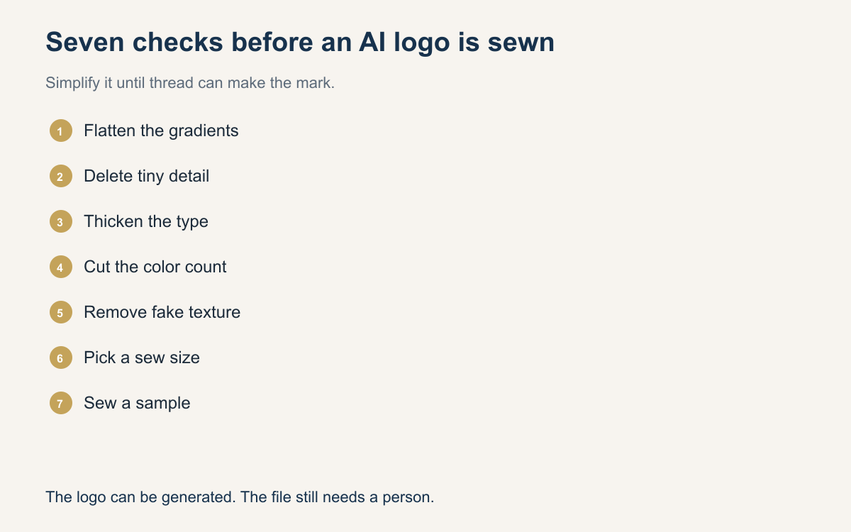
An AI-generated logo can look finished and still be a bad sew. Before you digitize, simplify gradients, kill tiny detail, thicken type, limit colors, remove fake texture, pick a real size, and sew a sample. The drawing is a start. A person still edits the stitch file.
A buyer will send a mark a picture tool drew this morning. It has a gold fade, a marble background, hairline script, and a tiny icon that looks sharp on a phone. They think the art is done because it looks done. You are looking at a drawing. Digitizing starts after you change that drawing into shapes thread can make on the blank they ordered.
Run seven checks every time, even when you are busy and the logo looks simple. The checks stop a pretty file from becoming a stiff, blurry sew-out. None of them are a mood. Each one is a change to the art or a test on fabric. If a check fails, fix the art before you build the stitch file and before you promise a date.
Call it a drawing, out loud
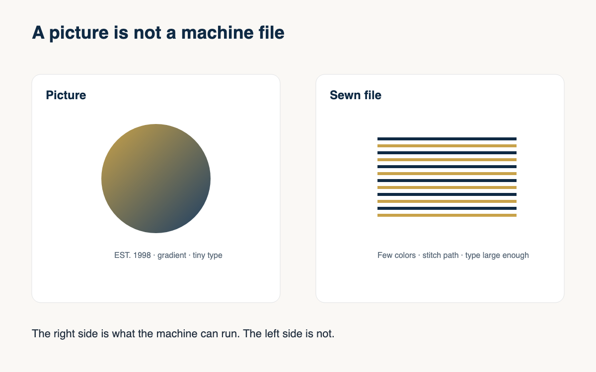
Say it plainly to the buyer. This is an AI-generated logo, and it is art, not a plan for the needle. That sentence keeps both of you honest. The tool chose pixels. It did not choose underlay, density, or whether the mark belongs on a cap. You will. If you skip the sentence, the buyer hears that you are about to sew the picture they love, including the parts thread cannot hold.
Open the file large, then again at the real sew size. Large shows you what they are proud of. Small shows you what will vanish. Save the original so you can show the before and after. Edit a copy. The pickup talk is easier when you can point at the change you made, instead of arguing from a memory of a file you already overwrote.
Gradients, tiny detail, and fake texture
Simplify gradients first. A fade from gold to white wants to be two flat colors, or one gold with the fabric as the light. Bands of many close shades look dirty in thread and add trims you do not need. Kill tiny detail next. Stars, whiskers, map lines, and a one-pixel outline around every letter go away. If you cannot see the shape at arm length, it does not earn a needle.
Remove fake texture. Marble, glitter, paper grain, and a picture that pretends to be stitches are drawings of a surface, not a surface you can sew. They explode into useless color changes. Flatten those areas to a solid. If the buyer loved the texture, say you are keeping the shape and the main color, and the fabric will supply the texture. That story beats a sew-out that looks like static.
Thicken the type and limit the colors
Thicken type until a satin column can turn and still read as a letter. Hairline script and outlined letters with no fill are the usual failure from an AI-generated logo. A quarter inch of letter height is a practical floor on many caps, and thinner than that becomes a guess. If the name only works in a delicate font, change the font or drop the word. A short bold name beats a slogan that sews as a smudge.
Limit colors to what the size can hold and what you stock. Three or four thread colors, plus the garment, is often the honest palette for a small mark. Every extra color needs area or it becomes a speck and another trim. Match the survivors to cones on the rack, not to the glow on the screen. Write the color names on the order so production does not invent a new gold at the machine.
Pick the size, then sew a sample
Decide the sew size in inches before you digitize, and build the file to that size. A logo approved at four inches and sewn at two will look crowded, and type you thickened may fall under the floor again. On a cap, check the height against the front panel. On a chest, check the width against the pocket and the placket. The size is a decision you write down, not a slider you touch after the file is built.
Sew a sample on the real goods or the closest scrap you have. Look at it in daylight, at arm length, and folded the way the garment will sit. If the fill is stiff, open the density. If the fabric shows through, fix the underlay. If a letter closes up, thicken it or remove it. Do not sew the run until the sample is one you would wear. The other checks are preparation. This one is proof.
Walk the seven checks in order
Use the list in order so you do not digitize a texture you meant to delete. The first five checks change the drawing. The sixth locks the size the file must match. The seventh proves the file on fabric. Jumping to the sample without the earlier checks wastes a hoop on a logo you already knew was too busy to sew as it arrived.
Show the buyer the cleaned version before you sew the order. Most people accept a simpler mark when they see it on the blank at the real size. The buyer who insists on the marble and the hairline is telling you the job should not be embroidery. You can decline. Seven checks are faster than ripping a stack of caps on a Saturday you already promised away.
- Simplify gradients into flat colors you can match to cones on the rack.
- Kill tiny detail that will not read at the sew size.
- Thicken type, or drop words under about a quarter inch tall.
- Limit colors to the count the placement can actually hold.
- Remove fake texture such as marble, glitter, or a fake stitch pattern.
- Decide the sew size in inches and build the stitch file to that size.
- Sew a sample on the real fabric and fix the file before the run.
An AI-generated logo is a confident drawing. It is not ready for the machine until you have simplified it and sewn it once. Run the seven checks before you digitize, then edit the stitch file the way you would edit any other job a person has to stand behind. The buyer can keep the original on a screen. The garment gets the version thread can tell the truth about.
A question for the group
Which of the seven checks catches the most bad logos in your shop, and which one do you still skip when you are in a hurry?